Hjørring Library in Metropol
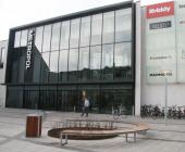
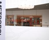
The library is part of a shopping mall called Metropol. Metropol is designet by the architects Schmidt, Hammer and Lassen and the library has a 30 year lease in it.
The interior is the interesting thing about the library. Bosch & Fjord - the architects for the interior - has really made some interesting and new shapes for furniture and design.
Authority and authority type
Hjørring KommuneTitle of library in local language
Hjørring BibliotekYear of completion
2008Address
Østergade 30, DK-9800 Hjørring, Denmark
Category of library
Public LibraryMore info on the building
http://www.hjoerring.dk/sw110496.aspAwards and recommended reading
Hjørring Bibliotek i Metropol
Jens Lauridsen
Bibliotekspressen, 2008 no.10, p. 22 (in Danish)(PDF)
Det her bibliotek er bare for fedest!
Tone Lunden
BCFOnline 2008, no. 2, p. 14-15 (in Danish)(PDF)
Hjørring Bibliotek on Facebook
Interior design
Bosch & FjordFurniture supplier
BCIOverall Cost
€ 1.750.000Detailed description
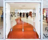
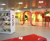
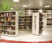
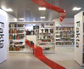
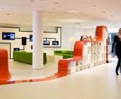
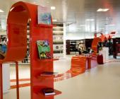
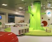
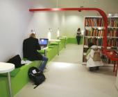
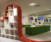
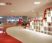
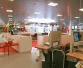
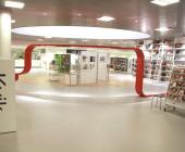
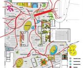
As you can tell by the pictures the library is connected through the long red tape that runs through the library - playful - and everywhere. Sometimes the band is a shelf other times just at decoration. The whole idea of the library is to encourage playfulness, surprises and most of all a place to be. The furniture signals where to be quiet and where you can be loud.
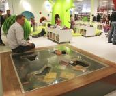
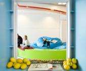
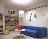
The colours are powerful and dominating - especially in the children's department where there is an area for VIPs - Very Important Parents, a reading tree and a wall with room for reading too. A creative piece of furniture is a “fish pond” for the smaller children with books in it. There is a huge bean bag with space enough for up to 20 children in the quiet part of the children’s department. The youth section has a huge pink “sitting blob”.
Both the adult section and the children’s section have a flexible scene with interchangeable settings hidden behind the more massive books shelves. The shelves themselves have all kinds of shapes and huge letterings to signal the content. The shelves organise the books and journals according to non-librarian systems in an attempt to communicate more directly with the citizens.
There are 4 study cells with warm orange colours on the walls and computers. Not among the pictures is a special “poet stair” that leads to a giant mouth that recites poetry.
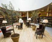
Not all scenarios are in vivid colours – for instance in the adult department there is a traditional reading area with Chesterfield furniture plants and old fashioned reading lamps and a long reading table with space for 22 persons is made of mahogany.
The architects Bosch & Fjord have cooporated with the librarians to crate an organic library.

